STUDIO HAZE Design
The direction STUDIO HAZE leans toward in design, and the site you are looking at is built to the same standard.
Black & White
We prefer screens kept in black and white, leaving color to the brands and the work.
Designed in Pairs
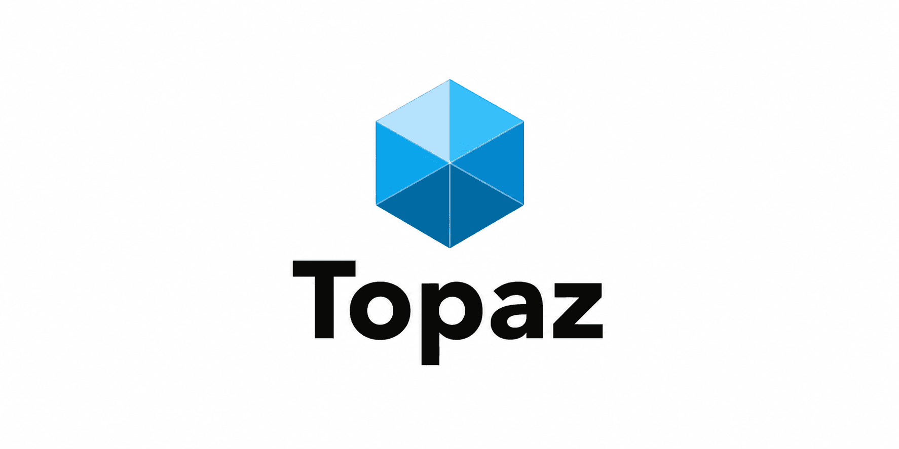
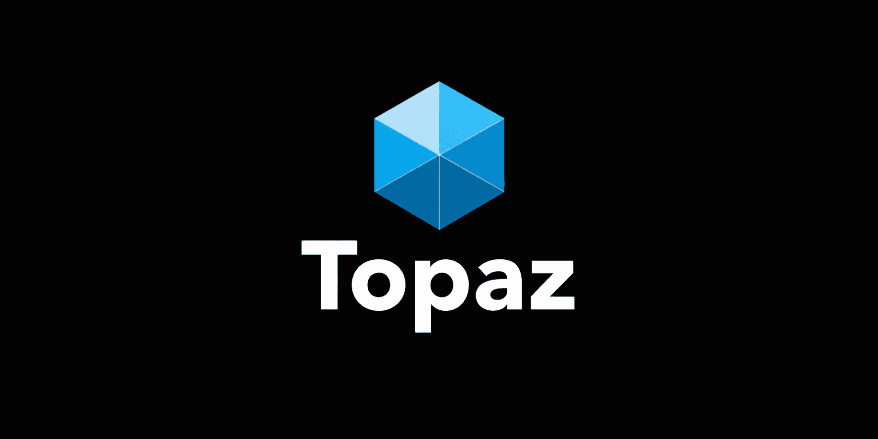
Screens and logos are made twice as a rule, light and dark. Not auto-inverted, but tuned separately as a pair.
No Flash
We want the first paint to be the finished one, and dislike screens that shift again after loading.
System Before Pages
We settle tokens and components before drawing any page, so the same parts can hold up the whole.
No Chrome
We keep no shadow and no rounded corner. The shape is made by type, space, and a hairline.
Color Tokens
The palette the studio starts from. Switch the theme and these swatches show the dark side.
Background
Foreground
Muted
Primary
Secondary
Accent
Typography
Display and body take separate roles. GMarket Sans for display, Pretendard for body.
Display / GMarket Sans
STUDIO HAZE
Body / Pretendard
Line height, tracking, and paragraph rhythm: the sentence you are reading is the body spec.
The Standards, Applied
This is what the direction above looks like applied to this site. Switching the theme toggle changes the samples along with it.
Light/Dark Logo Pairs
Brand logos are made as light/dark pairs that meet their background without a seam. Below is the Topaz pair in production.
The Spacing Scale
Spacing moves only along a fixed scale, so different screens keep the same rhythm.
4
8
16
24
40
First Paint
The server settles the theme from a cookie and the language from cookie plus Accept-Language before rendering, so both hold steady across reloads.
Cookie / Accept-Language
final first paint
Shared Parts
Parts like buttons and cards are shared across the whole site. Actions come in two tiers. One ink block per page carries the main move, and every visit or jump stands on letters and a rule with no box around it.
Badge